
Interior design blog
How to choose living room colours based on the view
When the landscape comes indoors: how to choose your living room colours based on the view
Anyone lucky enough to live with mountain views knows that a big window changes everything. It changes the light, your mood, the way you perceive the space through the seasons. But there's something that isn't always thought through from the start: the colours inside your home are in constant dialogue with what happens on the other side of the glass. When that dialogue works, the effect is extraordinary. When it doesn't, the most beautiful living room in the world can feel off without you quite knowing why.
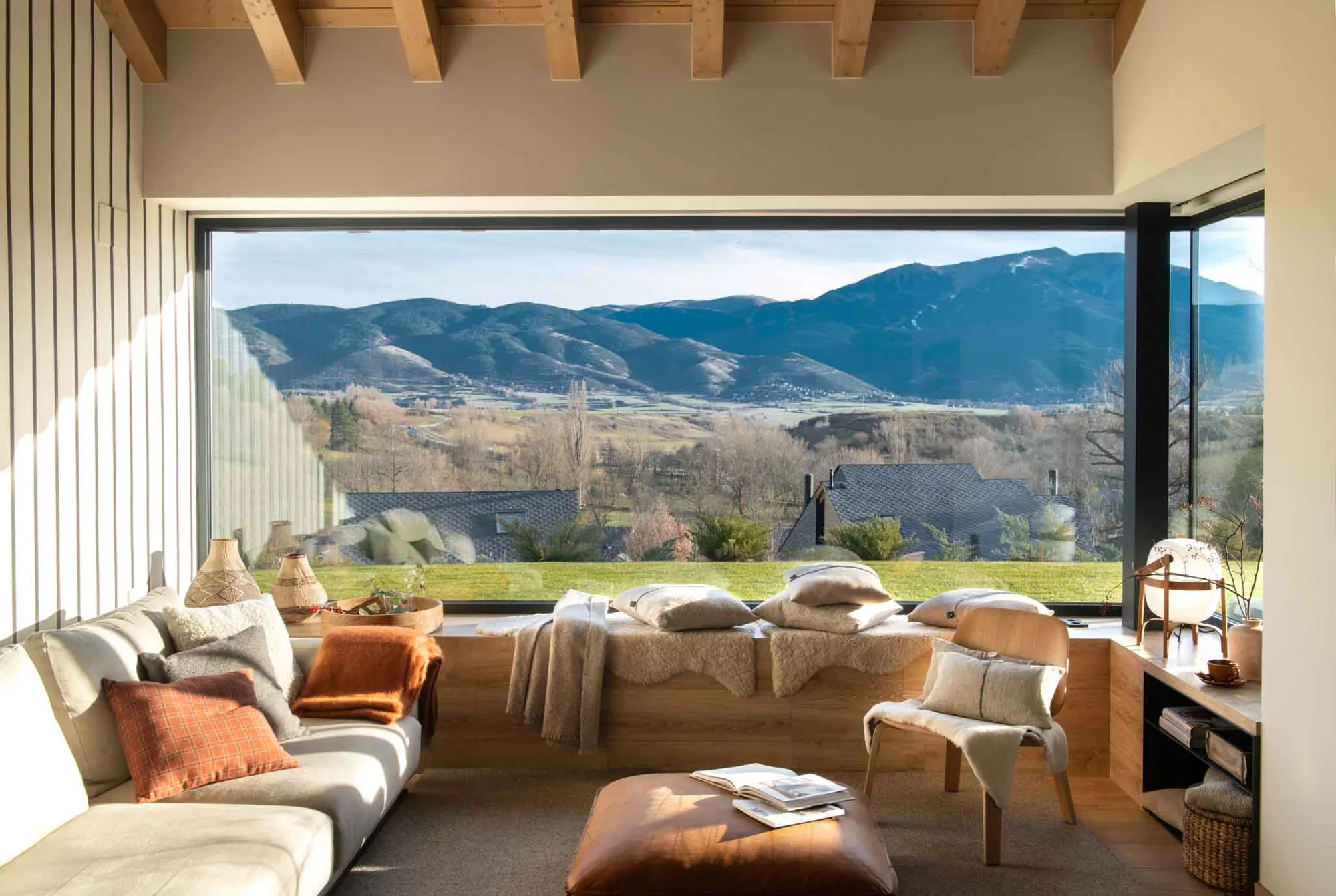
In this project in La Cerdanya, we wanted the living room to be a visual extension of the landscape, not a contrast with it. The green valley, the blue-grey mountains, the white winter sky and the ochres of the autumn fields make up a very specific palette. And that palette was the starting point for choosing every material, every fabric and every shade inside.
We don't decorate by looking at catalogues. We decorate by looking out of the window. The landscape already tells you which colours it wants inside.
At the heart of it all is the principle we most love to apply in these situations: use neutrals inside to amplify the colour outside. If everything outside is green, blue and grey, inside we go for off-whites, warm beiges, creams and soft greys. These tones don't steal the show from the view; they frame it and make it look even more vivid as you walk into the room. It's the same effect a mount has on a painting: the white around it makes the colours inside look more intense.
In this particular living room, the light sand sofa and stone-grey rug form the neutral base that lets everything else work. On top of that base, cushions and throws do the job of connecting with the landscape through colour. The rusty terracotta cushion picks up the tones of the autumn fields. The orange tartan cushion brings in the warmth of wood and afternoon light. Throws in beige and grey mohair complete a palette that, seen alongside the view, makes everything feel part of the same world.
Wood is the other great bridge between inside and out. The exposed wooden ceiling beams create a ceiling full of character that recalls the surrounding pine forests. The built-in bench under the window, also in wood, serves two purposes: it's a storage and seating piece that physically brings you right up to the glass, to the landscape, to the view. It's one of our favourite design decisions in this project, because it brings nature closer in a very literal and very elegant way at the same time.
The cognac leather of the central pouffe is another tone that appears directly in the landscape: in tree trunks, in the earth, in the bare branches of December. Materials such as natural leather, undyed linen, merino wool and oak share tones that nature has been using for centuries. That's why they work so well in homes overlooking the countryside or the mountains. They don't need justifying: they simply fit.
The table lamp in wood with a white shade is a good example of how even the smallest decorative objects can take part in this colour conversation. It isn't an eye-catching designer lamp seeking attention. It's an organic piece that blends in quietly and adds a layer of warmth when night falls and the landscape beyond the glass disappears.
If we had to sum up the principle in a single idea: in a house with a view, nature already gives you the palette. Your job as a decorator is to listen to it and respond with coherence. We've spent more than ten years learning to do exactly that.